What converts well, and what doesn't
Every image below runs through the same tracer. The difference is entirely in the source artwork. Load any of them into the tool to see exactly what it does.
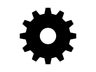
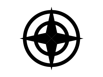
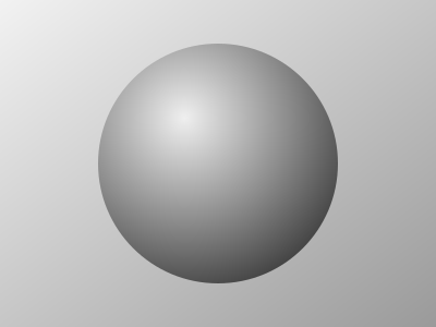
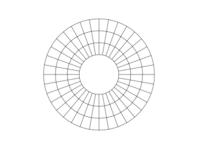
The tracer works by picking a brightness threshold and following the boundary between light and dark. That one sentence explains every example on this page: artwork with a clean light/dark split traces perfectly, and artwork without one cannot be rescued by any combination of settings.
These work

These cause problems

A quick checklist
| Property | Traces well | Causes trouble |
|---|---|---|
| Contrast | Solid dark on solid light | Gradients, shadows, soft edges |
| Resolution | 1000–2000 px on the long edge | Under 400 px, or heavy JPEG artifacts |
| Line weight | Strokes at least 3–4 px | Hairlines and 1 px outlines |
| Background | Flat white, or transparent PNG | Textures, photos, watermarks |
| Colour | Black and white, or clearly separated tones | Similar brightness in different colours |
Transparent PNGs are the easiest case of all. When the tool detects an alpha channel it traces from transparency instead of brightness, which sidesteps the contrast problem entirely. If your artwork is a logo with a transparent background, export it that way and skip the threshold slider.
On colour: two different colours can have identical brightness, a mid red and a mid green often do. The tracer sees brightness, not hue, so those merge into one blob. Convert to greyscale first to see what the tool will see.
Ready to try your own? Open the tracer, the first three exports are free, and tracing and previewing are always unlimited.